Plot types and options
Users can choose the plots from the options below.
Plot types
The standard plot types consist of:
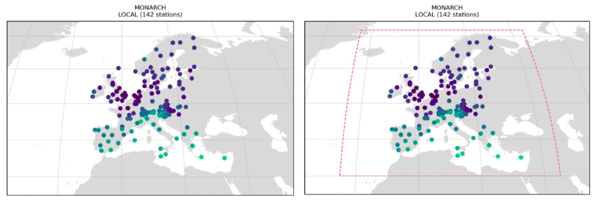
Map (
map)Metadata summary (
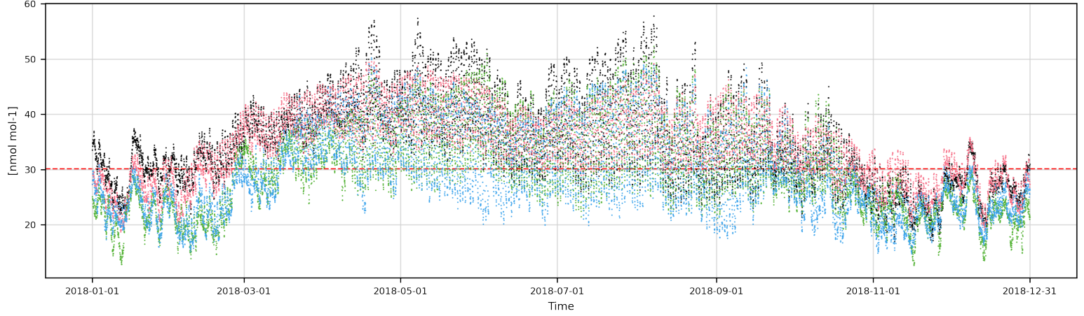
metadata)Timeseries (
timeseries)Periodic plot (
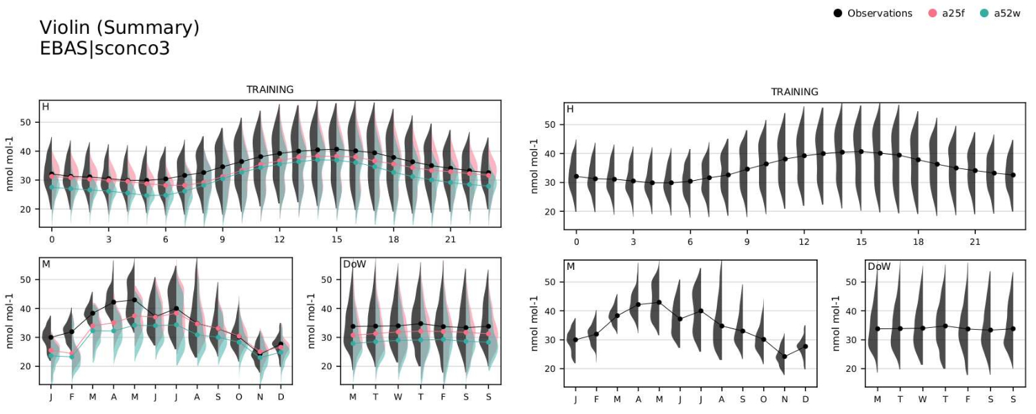
periodic)Periodic violin plot (
periodic-violin)Box plot (
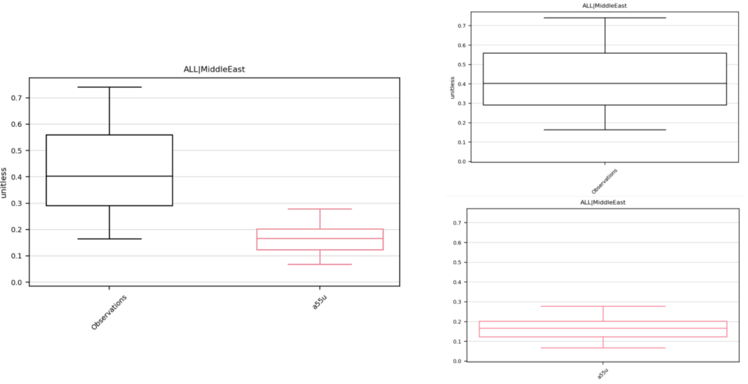
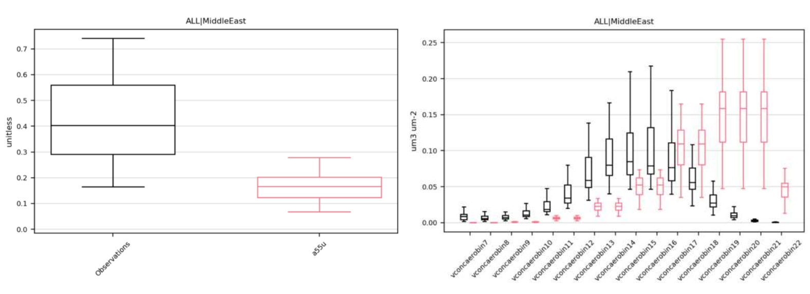
boxplot)Distribution plot (
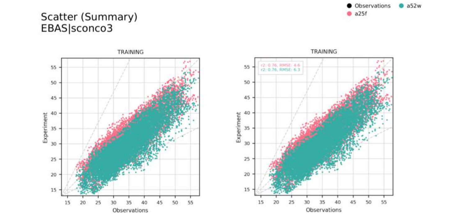
distribution)Scatter plot (
scatter)Heat map (
heatmap) - Not available in dashboardTable that gives one statistic per subsection per model (
table) - Not available in dashboardTable that gives multiple statistics per model (
statsummary)Taylor Diagram (
taylor)FAIRMODE target plot (
fairmode-target)FAIRMODE statistics summary plot (
fairmode-statsummary)Contingency table (
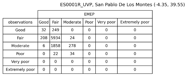
contingencytable)
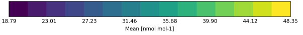
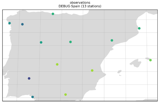
Map (map)
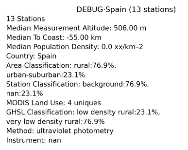
Metadata (metadata)
For the metadata plot the metadata displayed is set to a default list of metadata fields. These default options can be changed in settings/plot_characteristics.yaml.
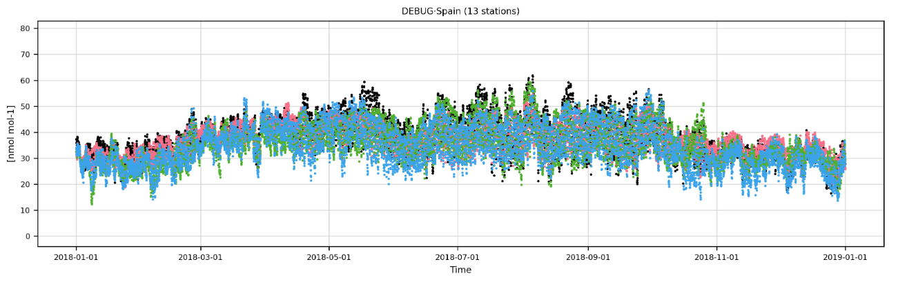
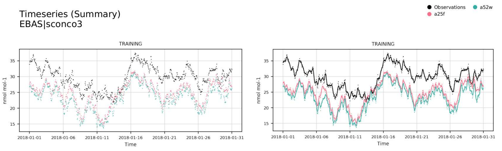
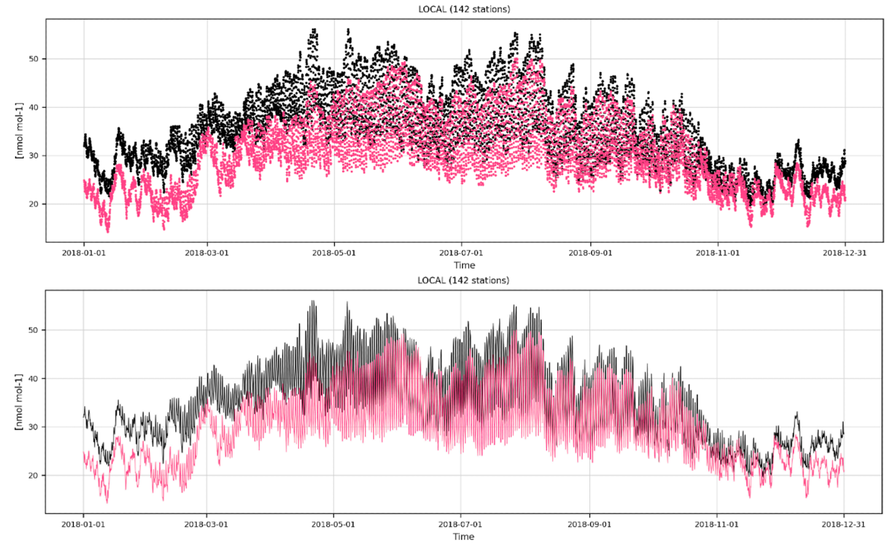
Timeseries (timeseries)
Periodic (periodic)
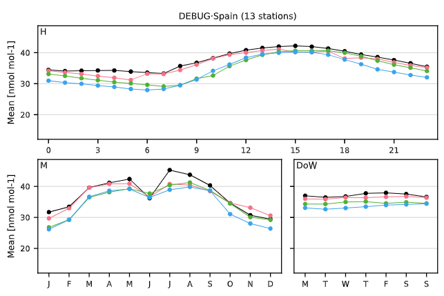
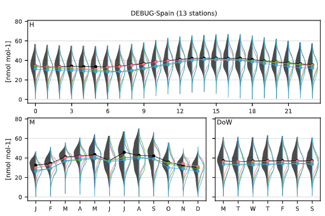
Periodic violin (periodic-violin)
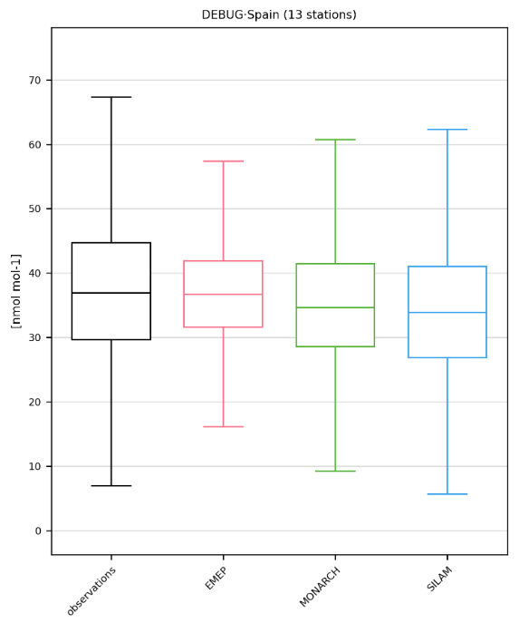
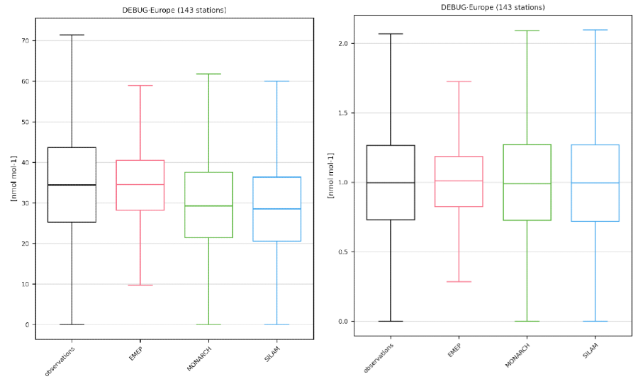
Boxplot (boxplot)
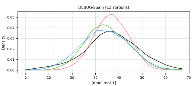
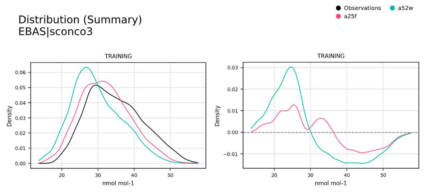
Distribution (distribution)
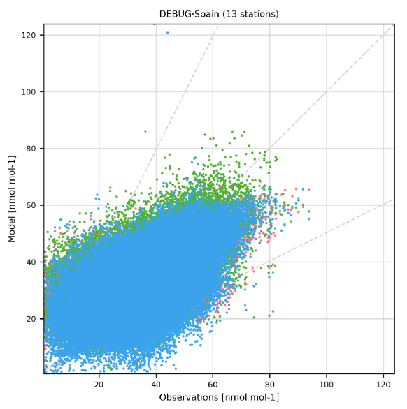
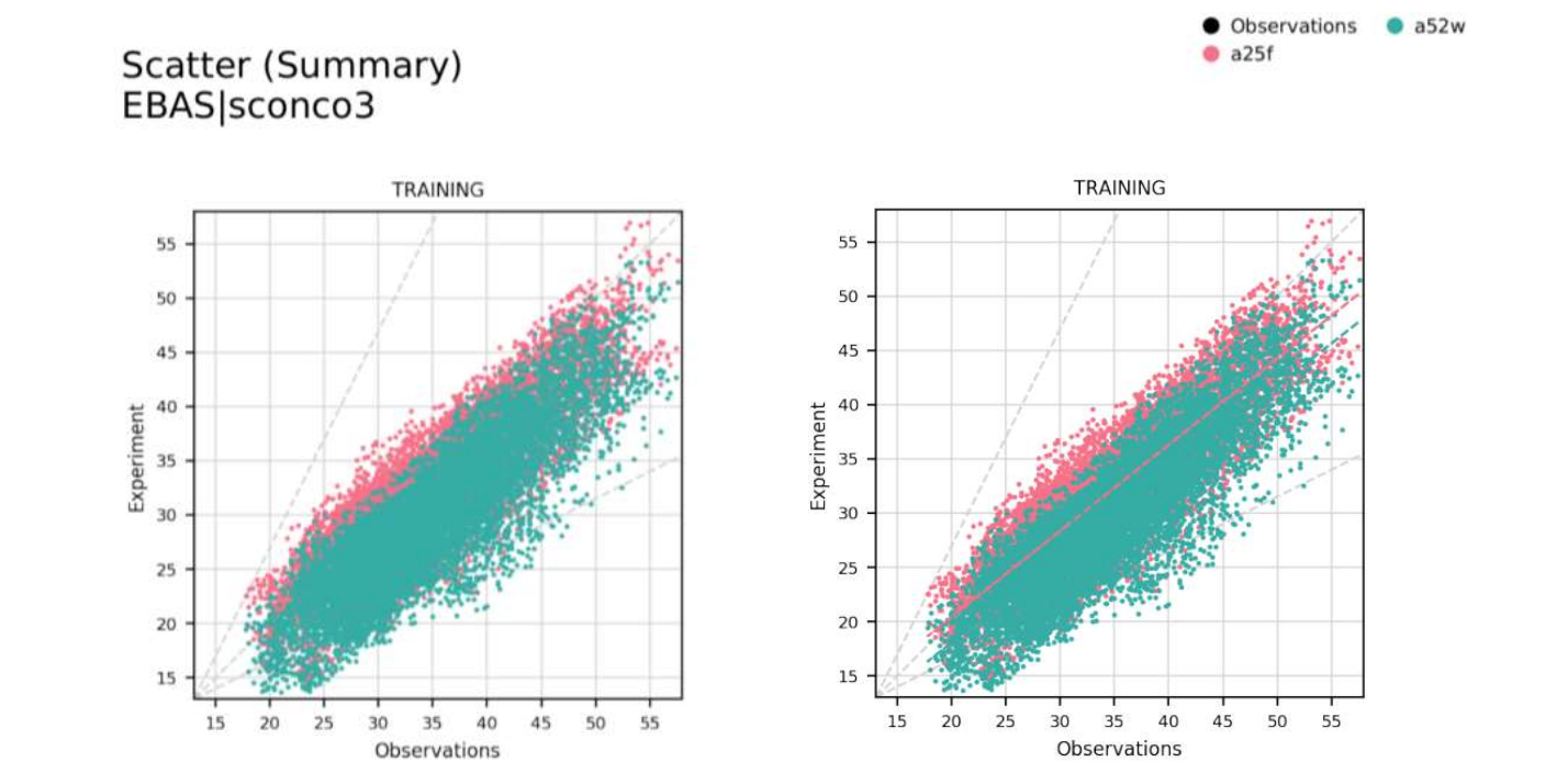
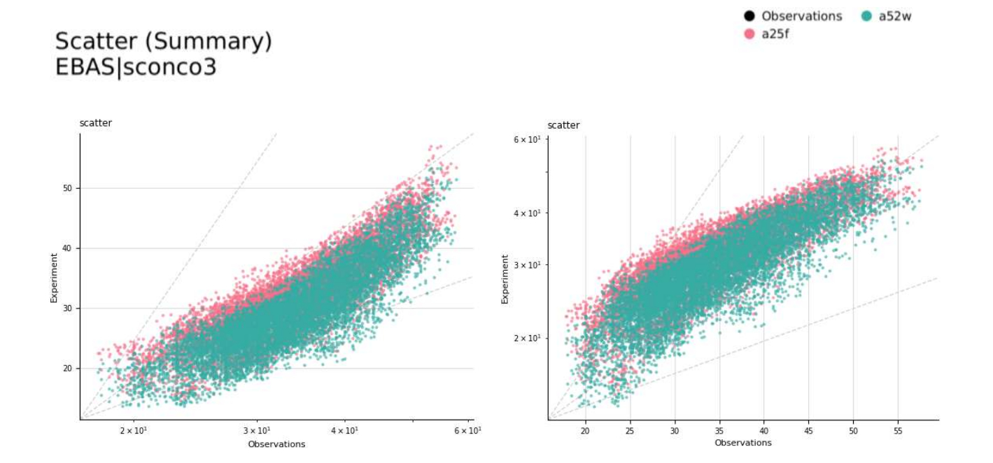
Scatter plot (scatter)
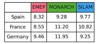
Heatmap (heatmap)
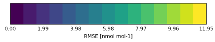
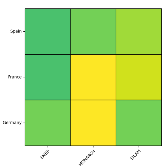
Table (table)
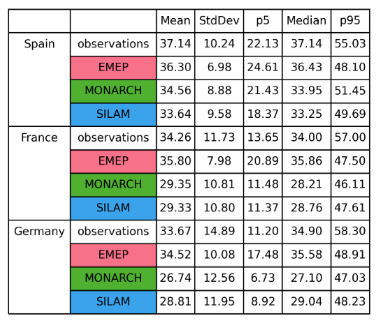
Statistics summary (statsummary)
For the statsummary plot the statistics displayed are set to a default list of absolute and bias statistics. These default options can be changed in settings/plot_characteristics.yaml.
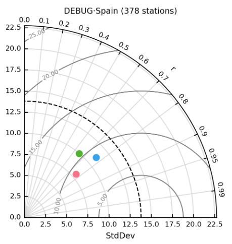
Taylor diagram (taylor)
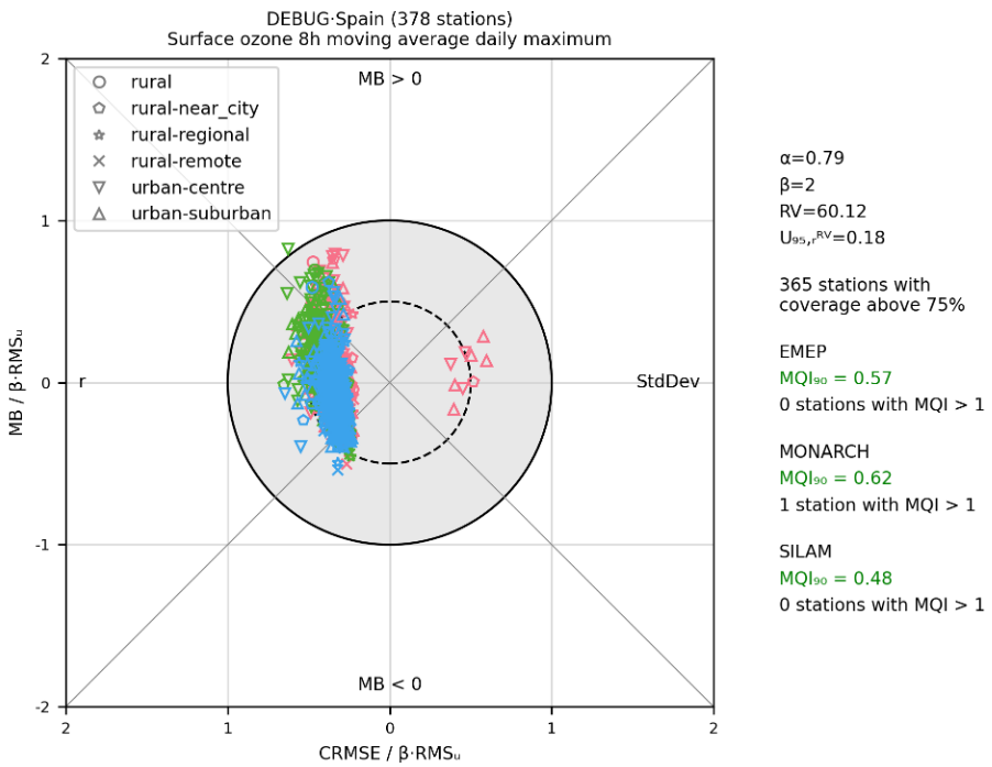
FAIRMODE target (fairmode-target)
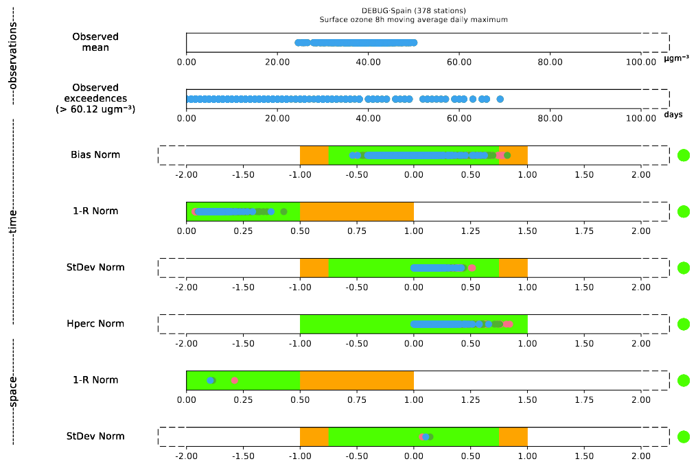
FAIRMODE statistics summary (fairmode-statsummary)
Contingency table (contingencytable) - Only per station
Choosing a statistic to plot (-[stat])
Some of these plots are created for specific statistics, namely: map, periodic, heatmap, taylor and table. In the report and library modes, this statistic is defined by aggregating the -[stat] field to the plot type. [stat] should be replaced with any of the base statistic names (e.g. p5, Mean) or model bias names (e.g. r2, RMSE). For example to show the median values spatially, map-p50 would be set as the plot name or map-r2 to show the coefficient of determination. The available statistic names are documented in settings/basic_stats.yaml and settings/model_bias_stats.yaml. For the Taylor diagram, only rand r2can be used.
The timeseries can also be used to show how statistics vary in time. In order to do this, we need to add -[stat] and the temporal resolution after the plot type name (e.g. timeseries-Mean-daily, timeseries-r2-monthly, timeseries-r-annual).
Plot options
It is possible to create advanced plots by adding one or more of the following words to each basic plot type or choosing the options in the dashboard:
Only show observations (_obs)
The extension _obs allows users to only show observations in their plots.
Plot types:
Dashboard: Not applicable
Report:
map,timeseries,periodic,periodic-violin,distribution,boxplotLibrary: Not applicable
Split the plots by label (_individual)
The extension _individual allows users to disaggregate the plots and see the plots by models, individually. This can help to visualise the results in a clear way when multiple models have been selected.
Plot types:
Dashboard: Not applicable
Report:
timeseries,periodic,periodic-violin,distribution,scatter,boxplot,taylor,fairmode-target,fairmode-statsummaryLibrary: Not applicable
Add annotations (_annotate)
If the configuration option _annotate is added, a box will be created on the plots to show several statistical data. The style and position of this box, as well as the statistics, can be defined by the user in plot_characteristics.yaml under settings by changing the parameter annotate_stats per plot type.
Plot types:
Dashboard:
map,timeseries,periodic,periodic-violin,distribution,scatter,boxplot,taylor,fairmode-targetReport:
map,timeseries,periodic,periodic-violin,distribution,scatter,boxplot,heatmap,taylor,fairmode-targetLibrary:
map,timeseries,periodic,periodic-violin,distribution,scatter,boxplot,heatmap,taylor,fairmode-target
Get the bias of the data (_bias)
Alternatively the plots can be modified to show, rather than the absolute observational vs model values, the bias between these pairings. This is done by adding _bias to the base plot names, for example: distribution_bias or periodic-Max_bias.
Plot types:
Dashboard:
timeseries,periodic,distribution,statsummaryReport:
map,timeseries,periodic,distribution,heatmap,table,statsummaryLibrary:
timeseries,periodic,distribution,heatmap,table,statsummary
Add a smooth line to the timeseries (_smooth)
Adding the option _smooth to the timeseries plot will plot a smooth line over the timeseries.
Plot types:
Dashboard:
timeseriesReport:
timeseriesLibrary:
timeseries
Add a regression line to the scatter plot (_regression)
Adding the option _regression will plot the linear regression between observations and model.
Plot types:
Dashboard:
scatterReport:
scatterLibrary:
scatter
Hide points and only show regression / smooth lines (_hidedata)
The option _hidedata needs to be accompanied by _smooth in the timeseries plot and by _regression in the scatter plot.
Plot types:
Dashboard:
timeseries,scatterReport:
timeseries,scatterLibrary:
timeseries,scatter
Make the scale logarithmic in x axis (_logx)
Adding the options _logx will set the x axis to be logarithmically scaled.
Plot types:
Dashboard:
distribution,scatterReport:
distribution,scatterLibrary:
distribution,scatter
Make the scale logarithmic in y axis (_logy)
Adding the options _logy will set the y axis to be logarithmically scaled.
Plot types:
Dashboard:
timeseries,periodic,periodic-violin,distribution,scatter,boxplotReport:
timeseries,periodic,periodic-violin,distribution,scatter,boxplotLibrary:
timeseries,periodic,periodic-violin,distribution,scatter,boxplot
Get plot by more than one network species (_multispecies)
Incorporate all read species in the plot type.
Plot types:
Dashboard: Not applicable
Report:
boxplot,heatmap,table,statsummaryLibrary:
boxplot,heatmap,table,statsummary
Show the model grid in the maps (_domain)
Adding _domain will add the model grid on top of the map.
Plot types:
Dashboard:
mapReport:
mapLibrary:
map
Add threshold line (_threshold)
Adding _threshold will add a line indicating the exceedances. These exceedances are set in settings/exceedances.yaml.
Plot types:
Dashboard:
timeseries,periodic,periodic-violin,distribution,scatter,boxplotReport:
timeseries,periodic,periodic-violin,distribution,scatter,boxplotLibrary:
timeseries,periodic,periodic-violin,distribution,scatter,boxplot
Normalise boxplot (_normalise)
Adding _normalise will normalise the boxplot.
Plot types:
Dashboard: Not applicable
Report:
boxplotLibrary:
boxplot
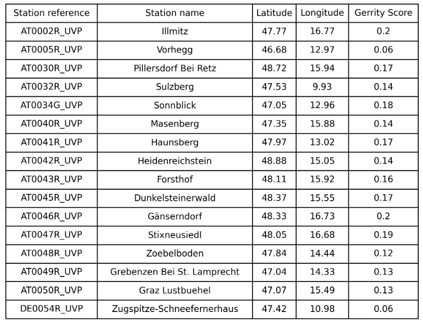
Transform contingency table into gerrity scores table (_gerrity)
Adding _gerrity will create a new table showing the gerrity scores per station.
Plot types:
Dashboard:
contingencytableReport:
contingencytableLibrary:
contingencytable